





Back

Intelliguard

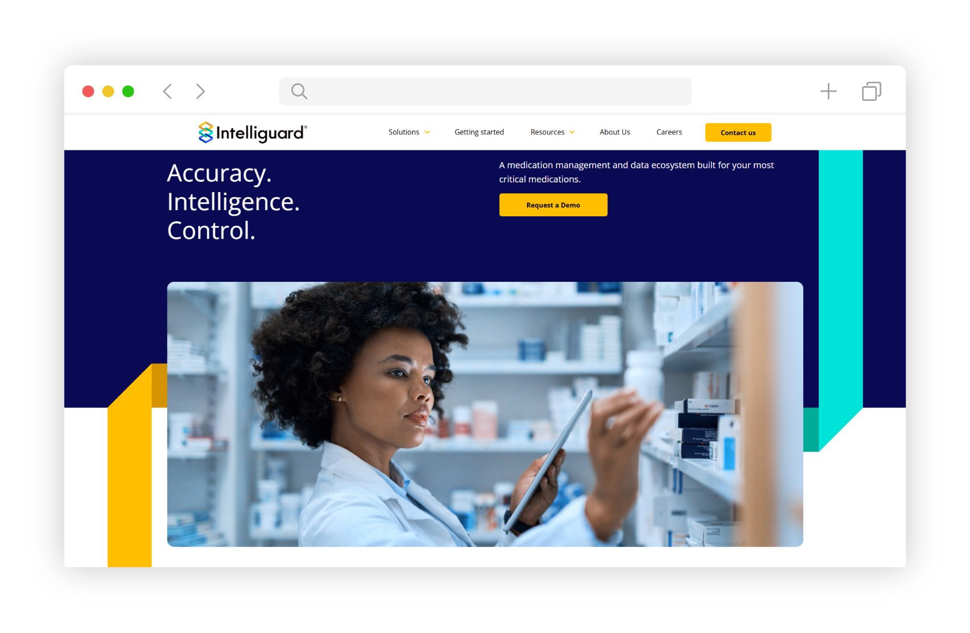
Understanding that hospitals are often averse to dealing with IT-related issues, we shifted the focus from promoting Intelliguard as a technology product to positioning it as a safety product. This strategic repositioning highlighted the crucial role of Intelliguard in enhancing patient safety and medication management compliance, rather than its technological features.

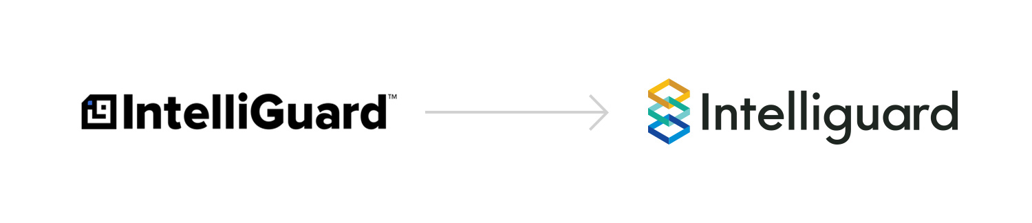
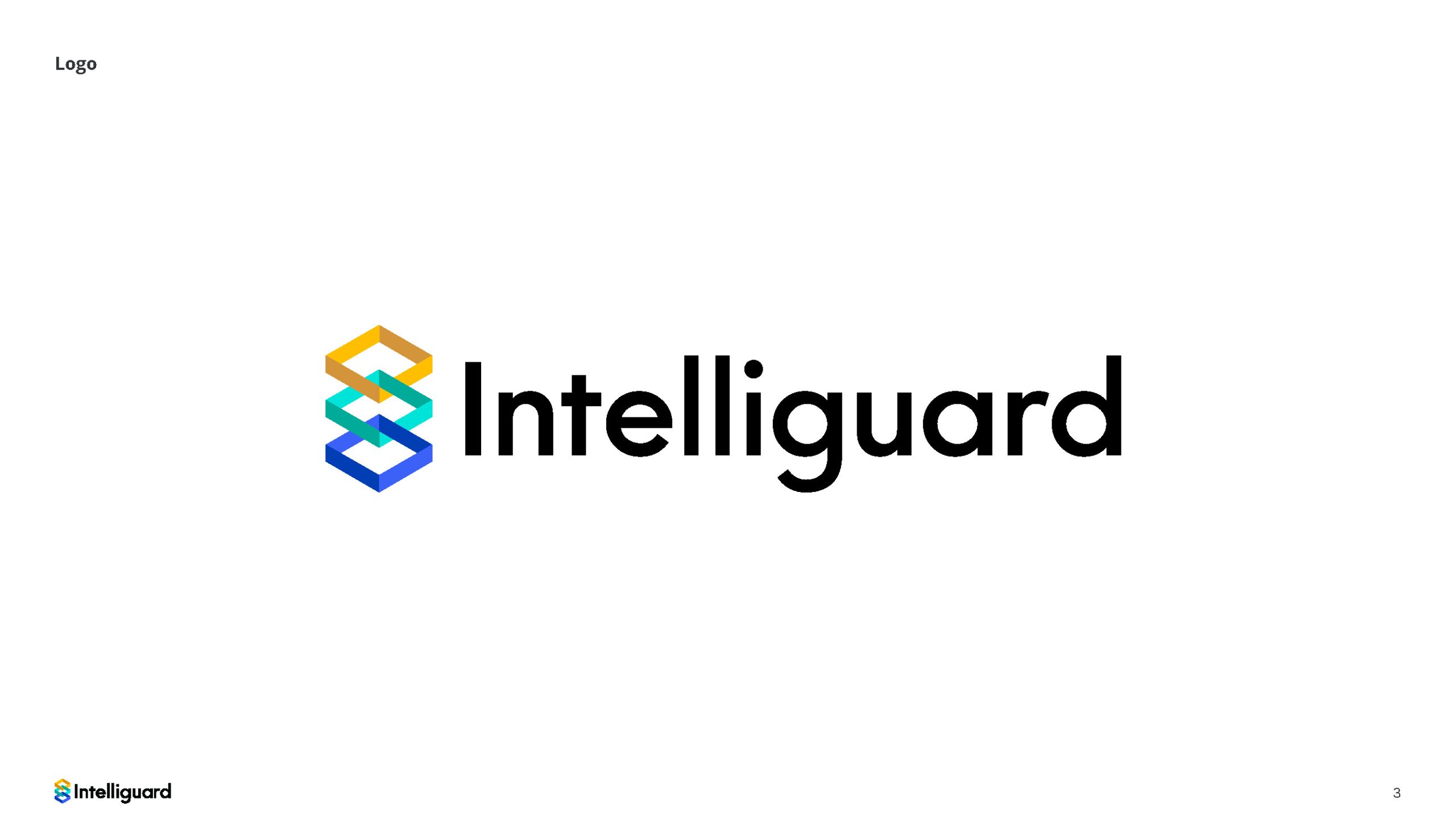
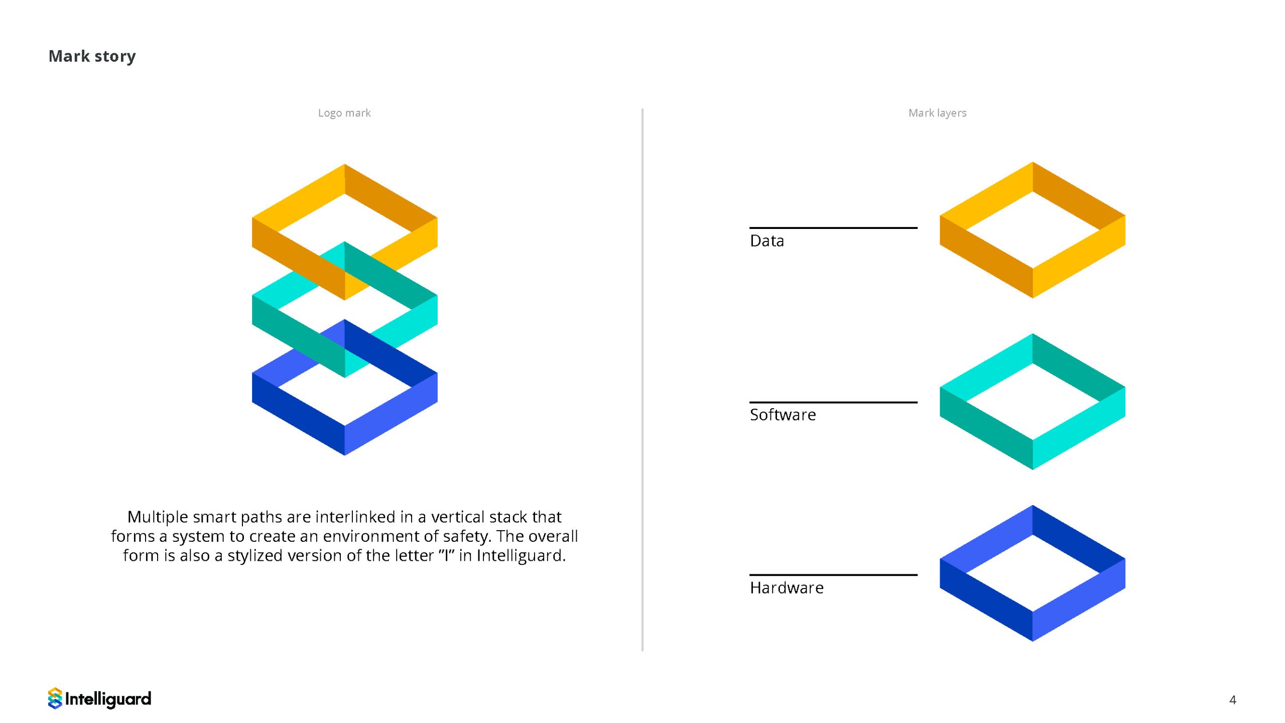
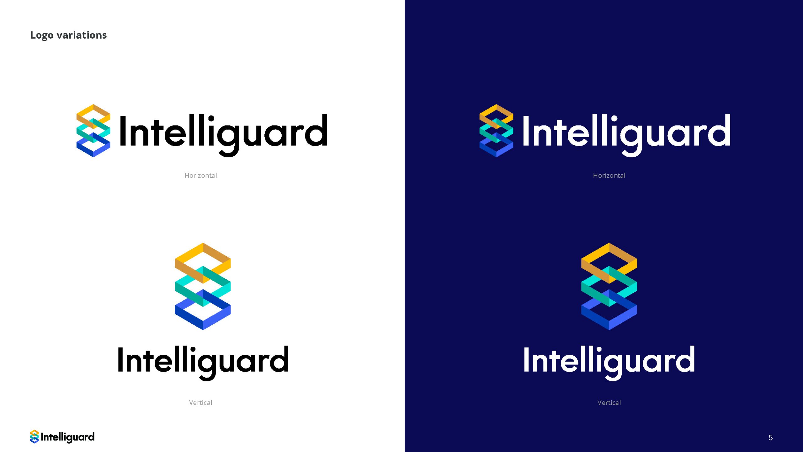
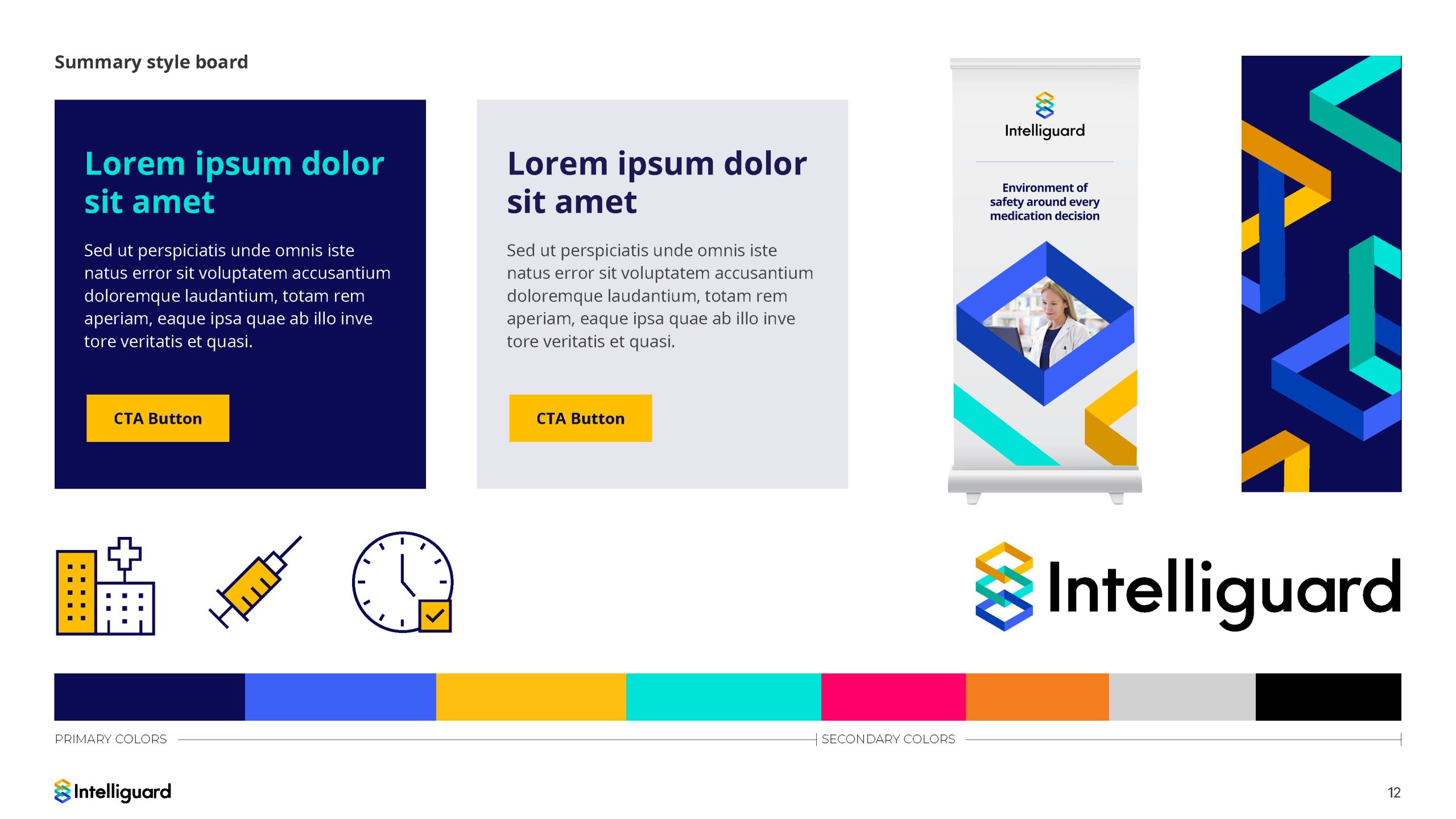
Multiple smart paths interlinked in a vertical stack that forms a system to create an environment of safety. The overall form is also a stylized version of the letter ”I” in Intelliguard. This logo represents how Intelliguard creates an environment of safety. The environment is represented by the different layed paths. Each path represents products, software  and data within a three dimensional environment. These layers are connected and create an environment of safety around every medication decision.

I developed and presented this logo and was picked by the client to move forward and represent their company for the future. In addition to the log and campaign work I also developed brochures, and social media. Also developed the storyboard and worked with our editor to develop a marketing video.

Marketing Campaign Concept

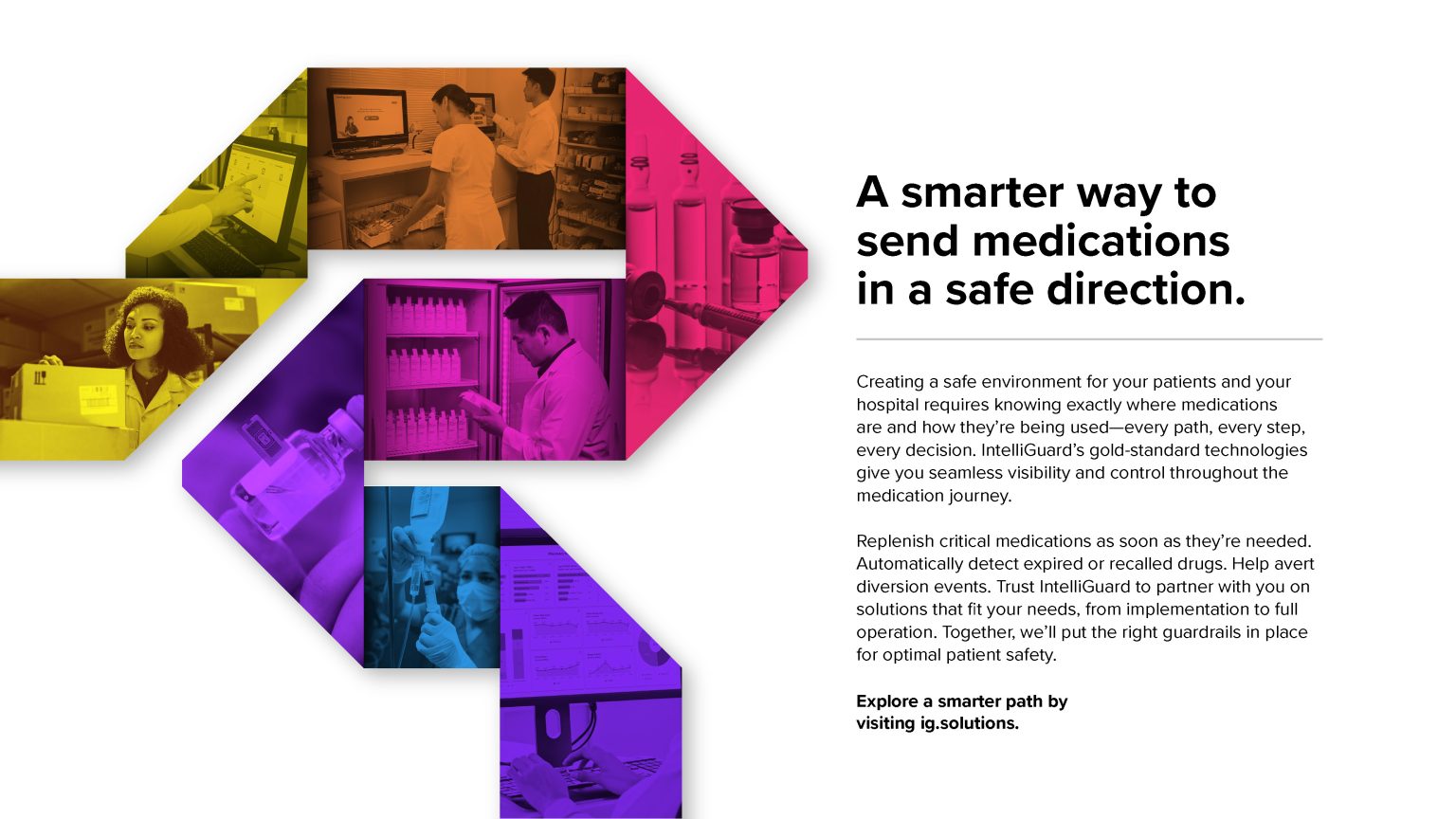
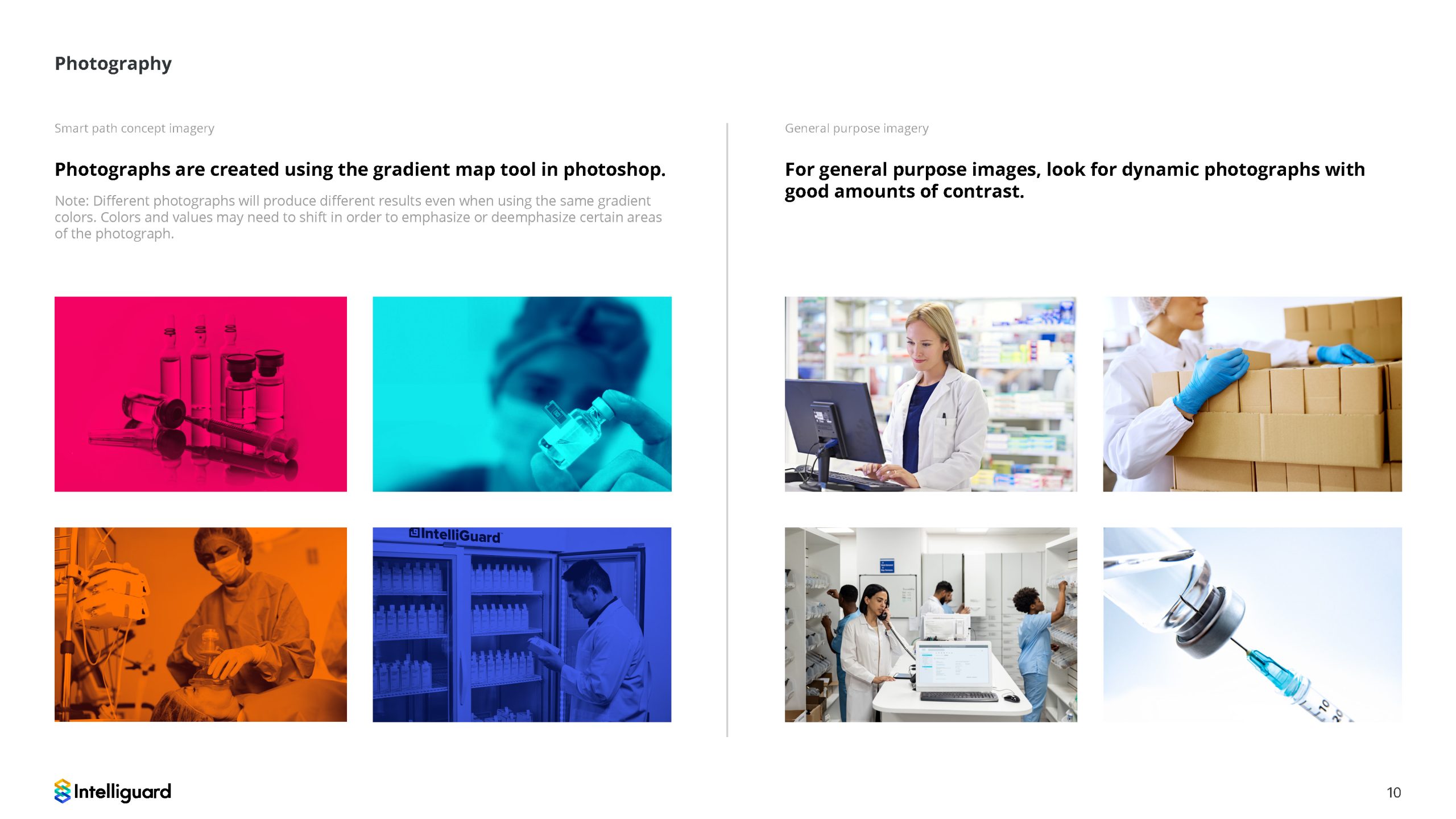
Developed a marketing campaign for intelliguard which was the smart path concept. The client loved the idea so much I used the look and feel of the concept to influence the logo design so everything felt like a cohesive brand.

Brand Guidelines

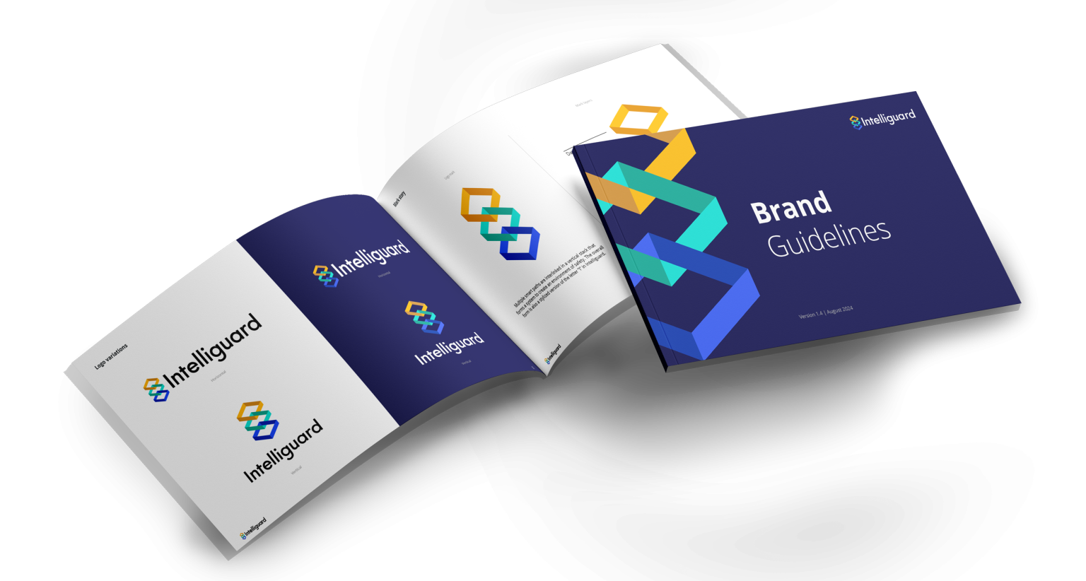
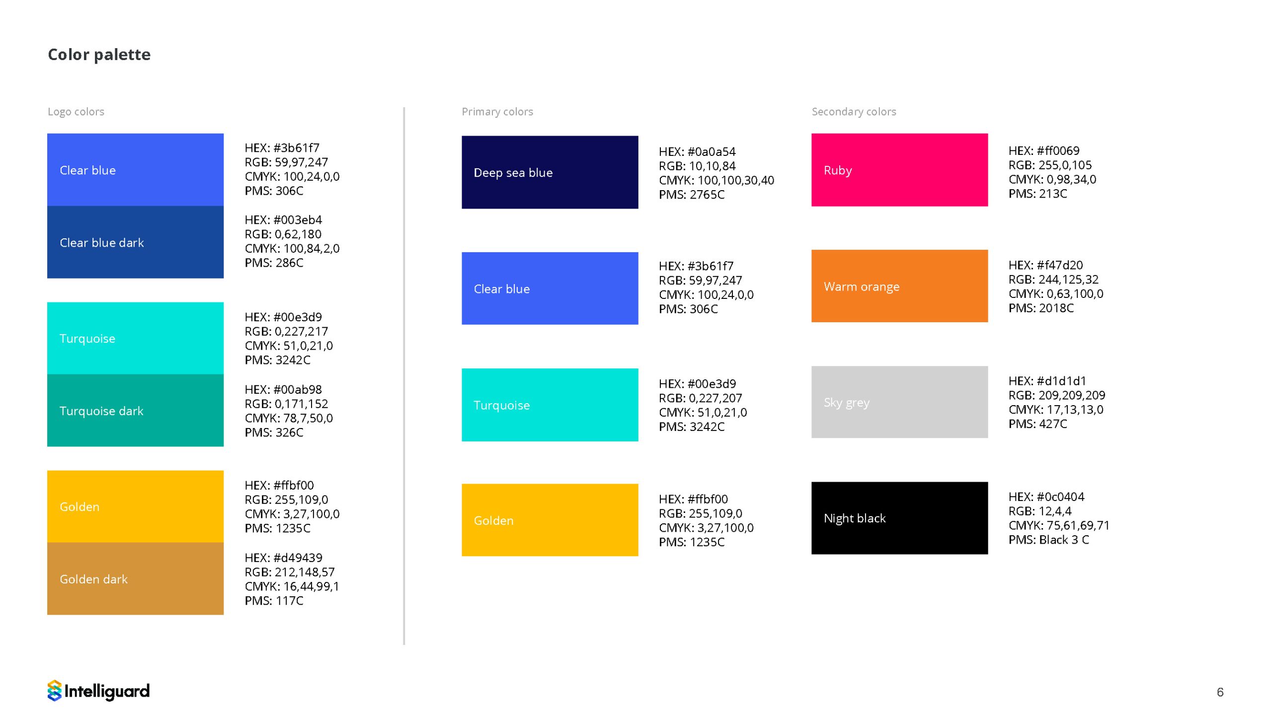
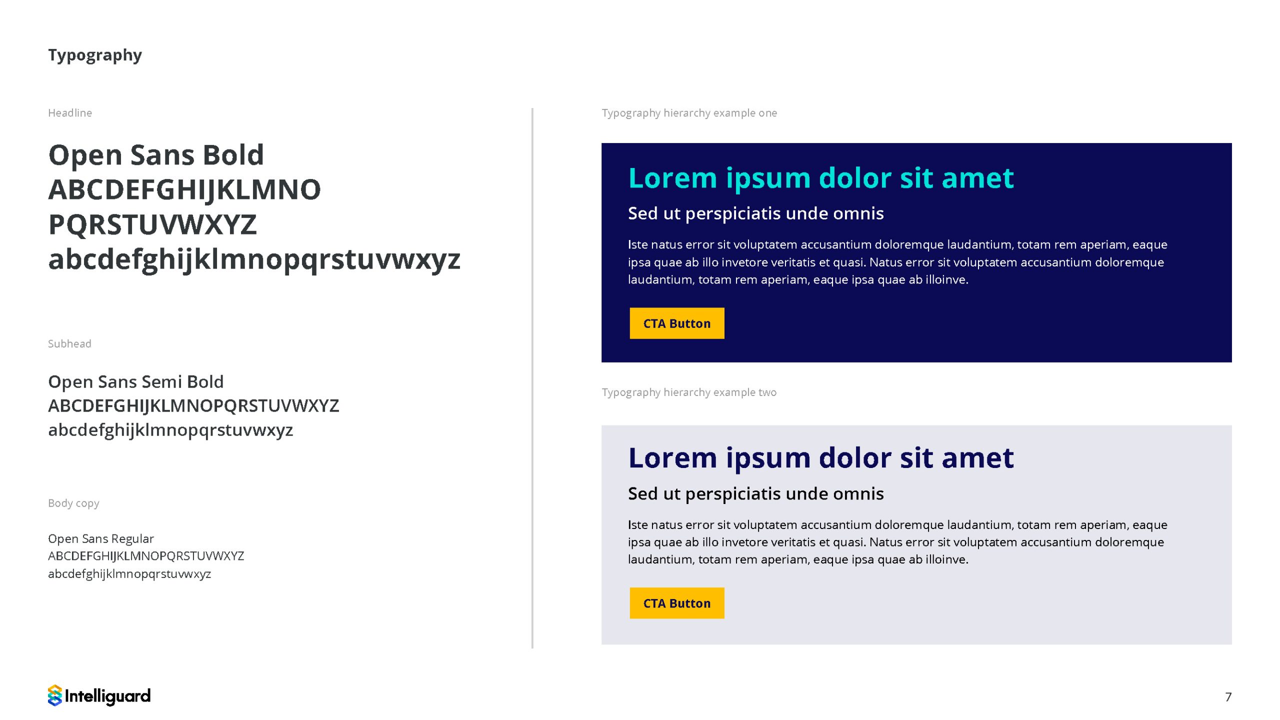
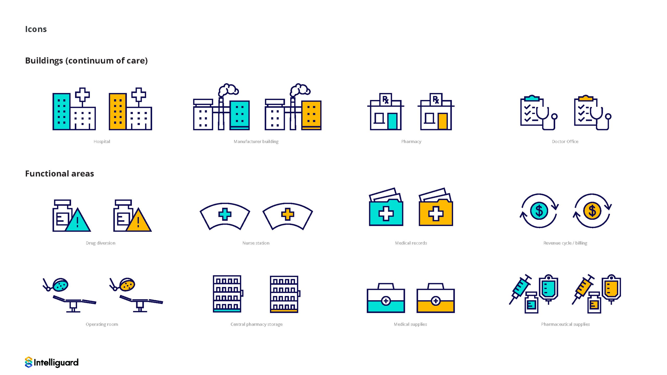
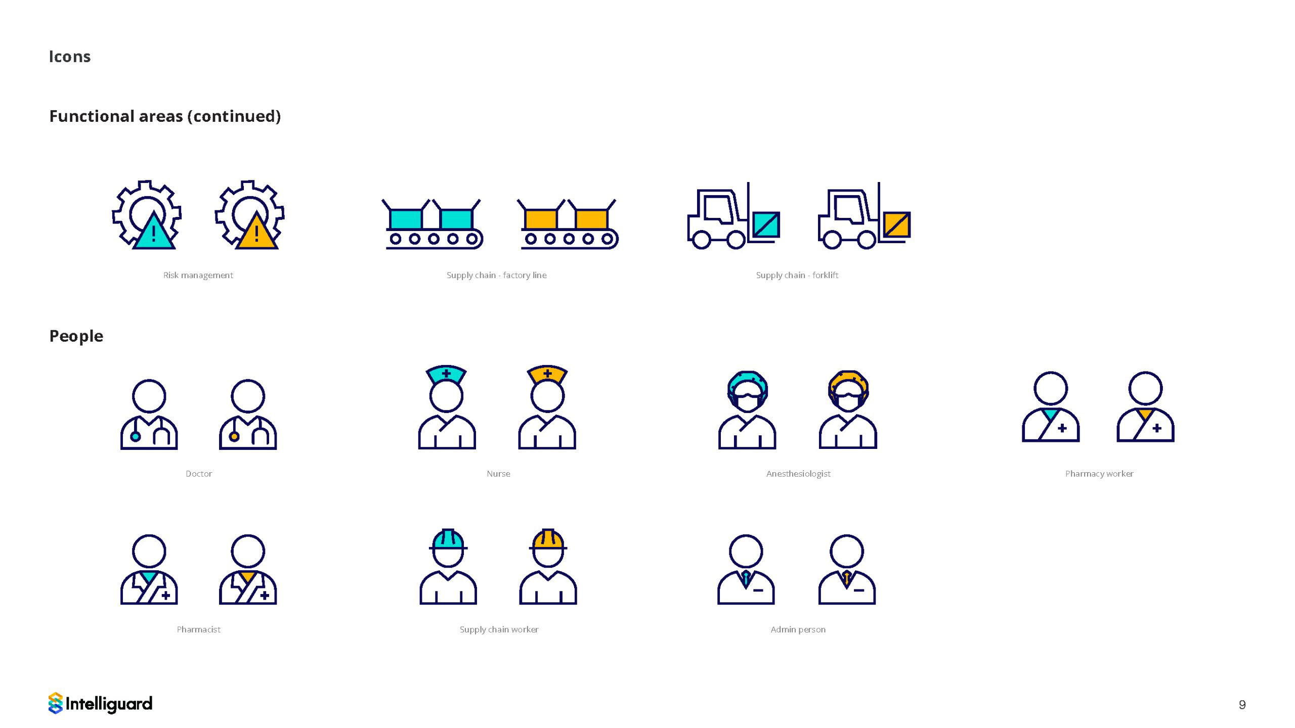
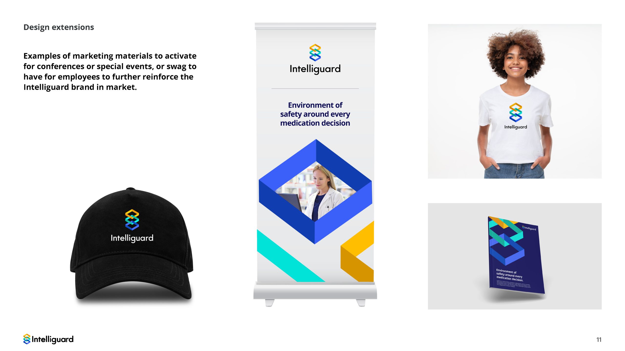
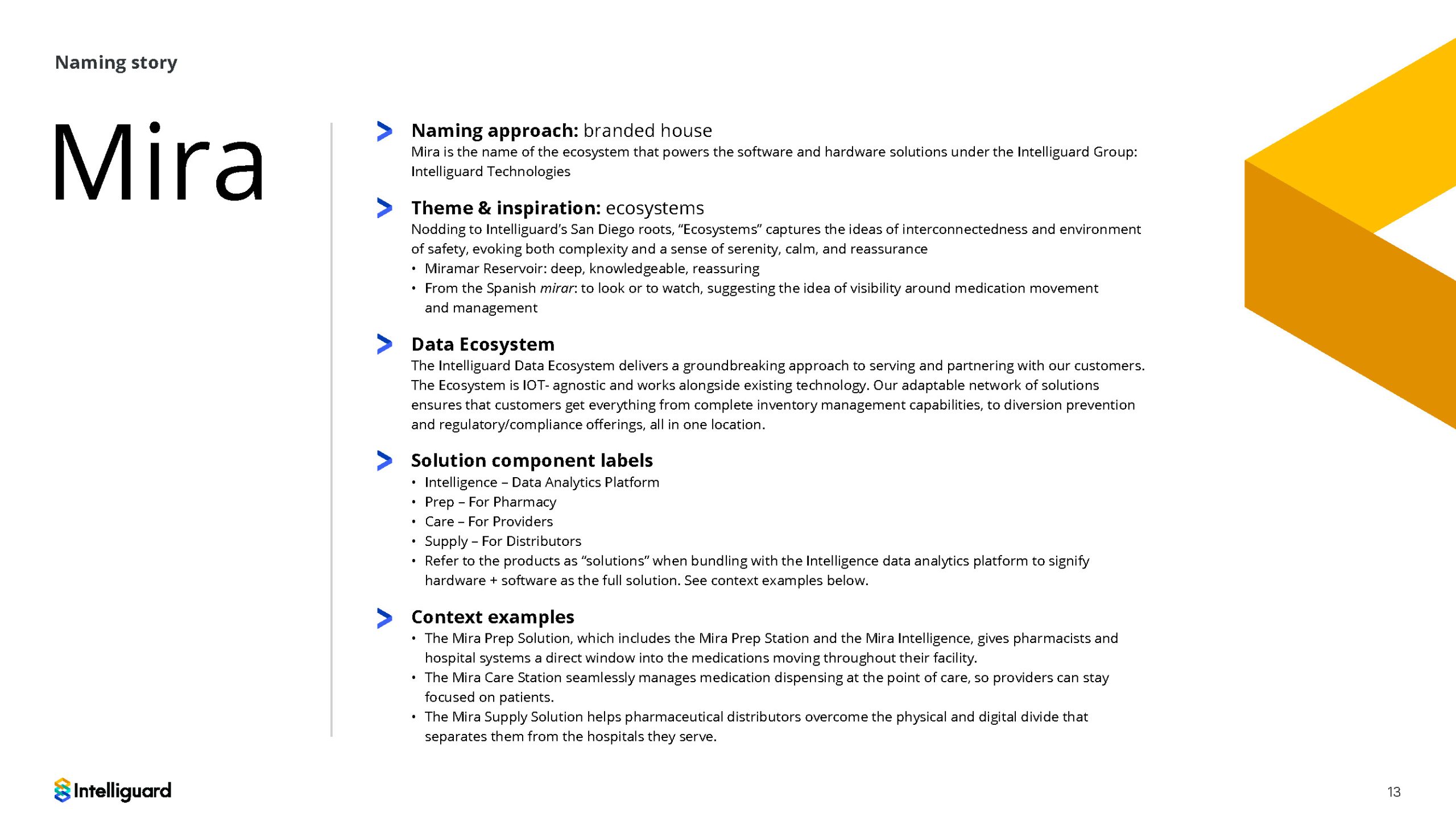
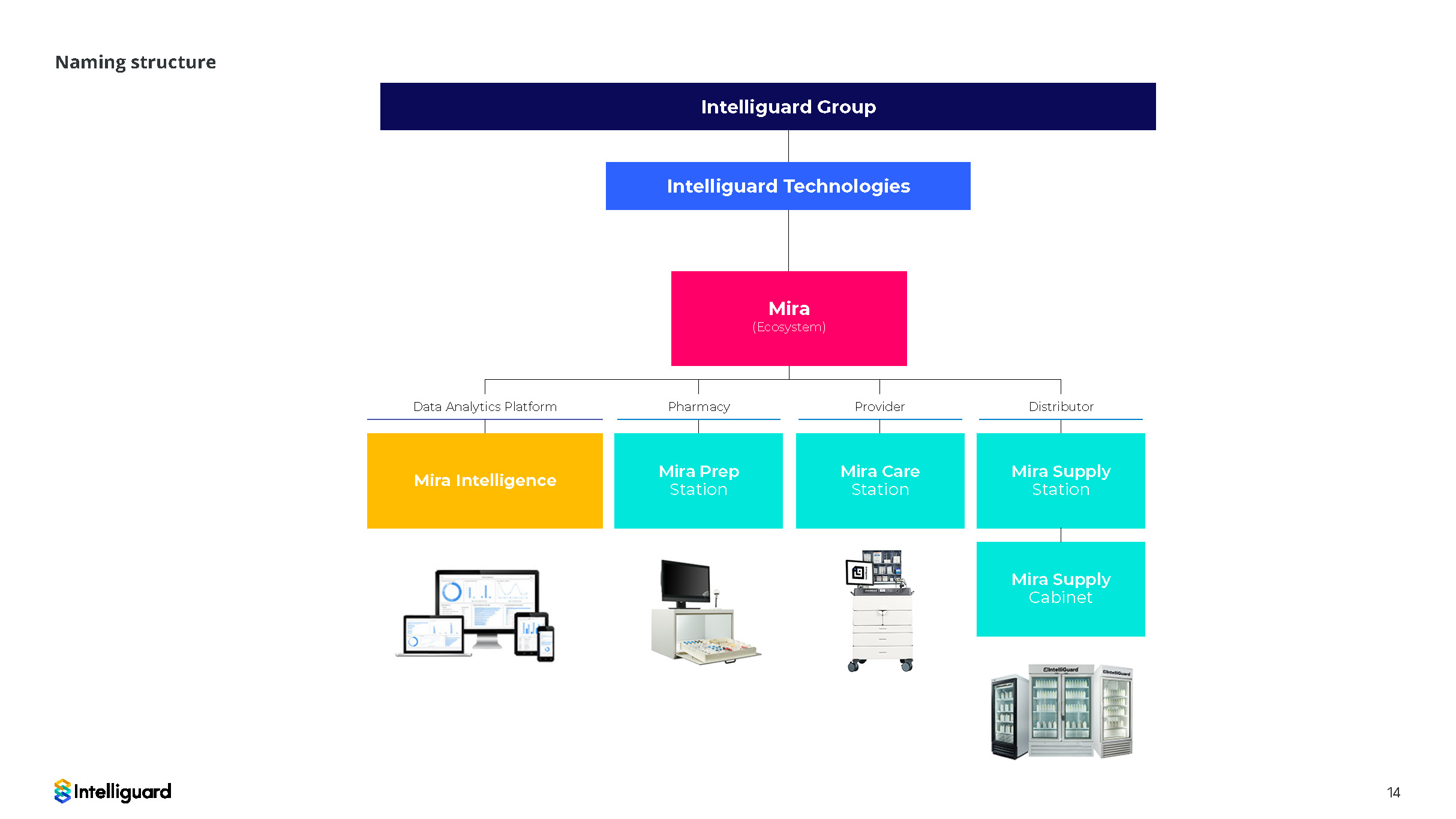
After developing the logo the client needed an updated visual guidelines to help the internal team create additional marketing assets in the future.

Sales Brochure

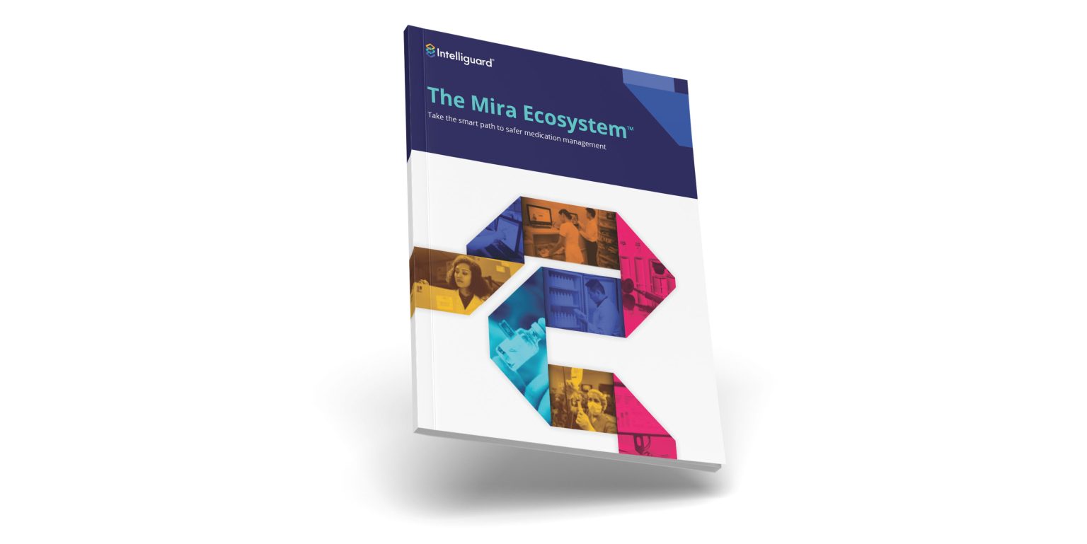
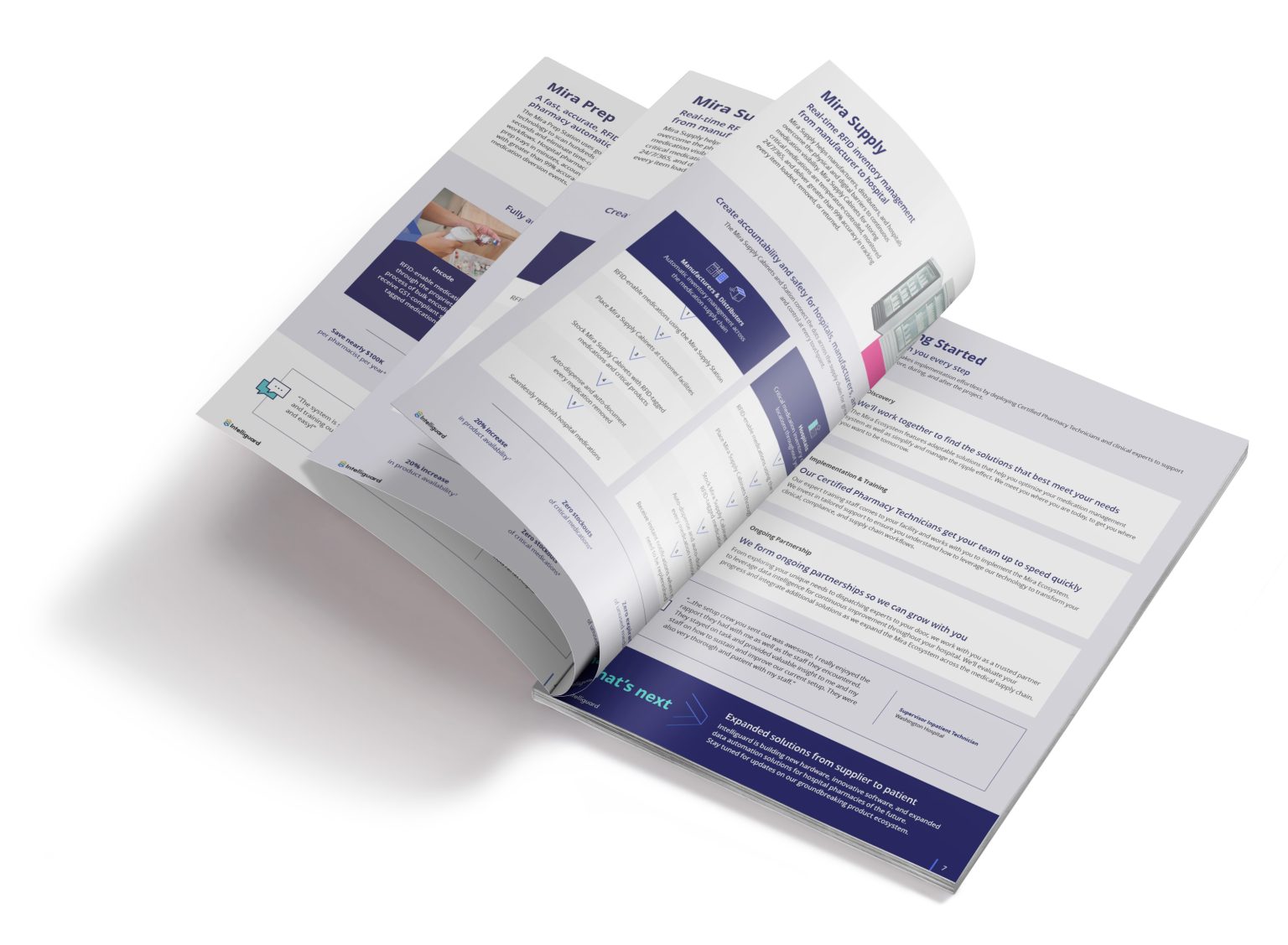
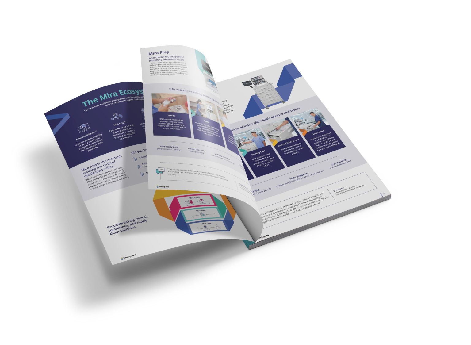
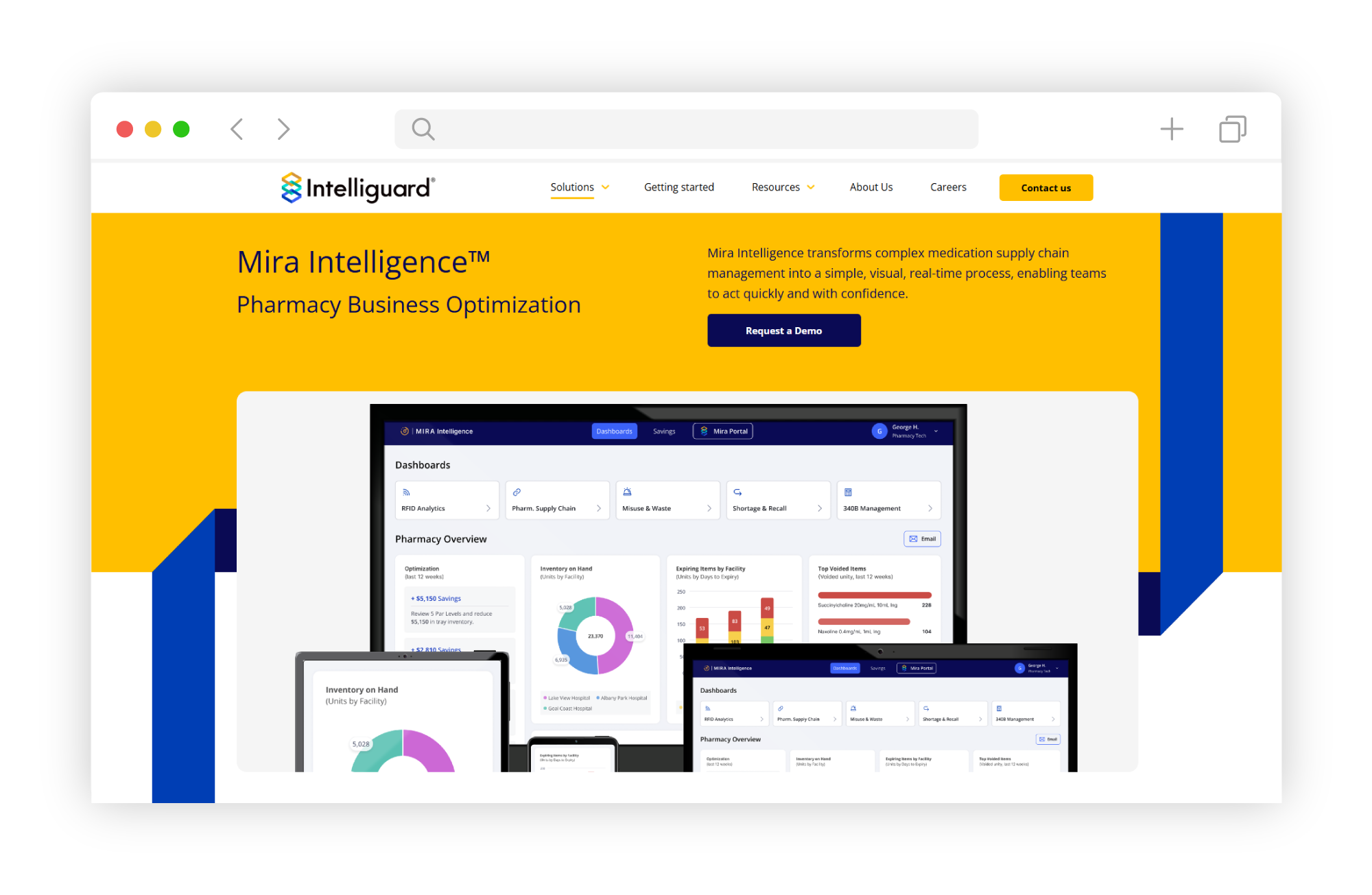
Develped a sales brochure which was then used as a whole for the marketing team and split up into individual sections

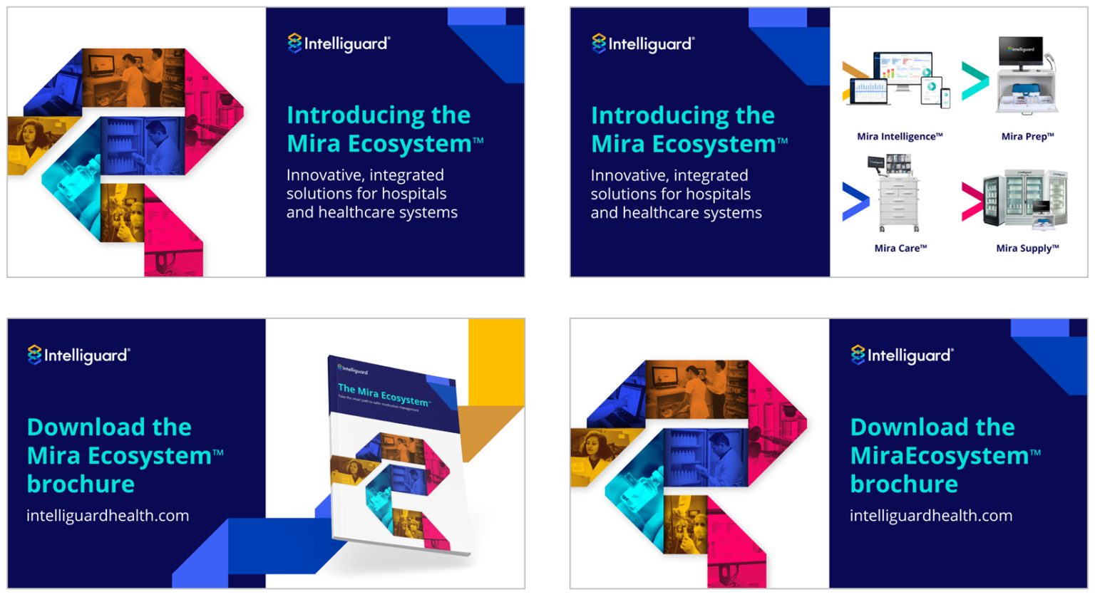
Social Ads

Developed a handful of social ads to match the branding